Fuji X100T Review | Kevin Mullins
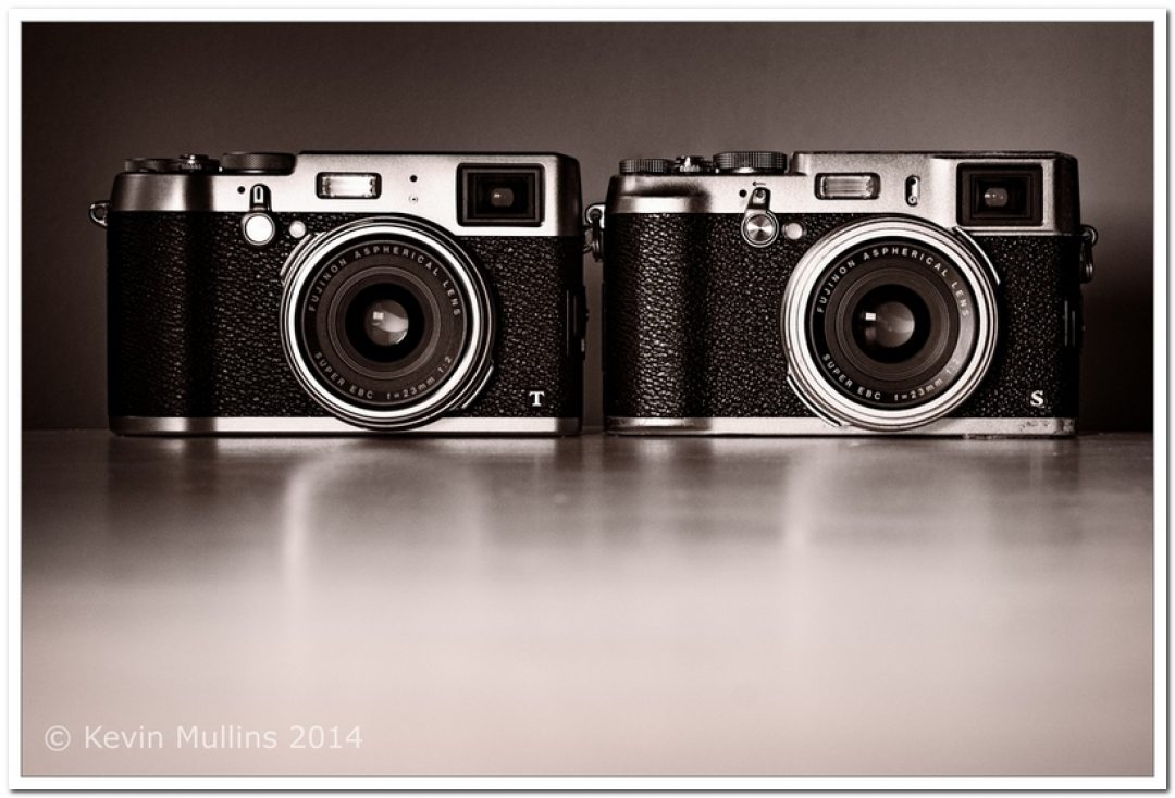
Looks familiar right? Fuji have remained faithful to the sleek retro design that we first saw with the introduction of the X100 over four years ago. The Fuji X100T is distinguishable from the X100S, aesthetically, in only a few places on the chasis of the camera. Most notably, on the back, the Fuji X100T now boasts a much more uniformed button configuration that I’m hoping we will see rolled out across all newer Fuji cameras. One of the biggest feedback comments I get is that the cameras should all share the same ergonomics where possible and it seems Fuji are heading in that direction. The command dial has been replaced with a four-way button system. There are no issues with the tactility of the buttons and they are responsive and quick to depress. Lesson learnt from the X-T1! To my hand, the “grip” side of the camera seems larger too – and certainly feels more ample when holding it. The Fuji X100T boasts seven programmable buttons which are handily placed throughout the camera body. Somewhat confusingly, the button labelled with the “bin” (delete) icon on my camera was actually pre-configured for Photometry. This is how I would prefer it and it remains in a similar position to the X100S default configuration. In my hand, the camera feels almost identical to the X100S. The viewfinder selector has returned to the more vertical orientation which I prefer and, apart from the button configuration, and the slight size and weight loss the Fuji X100T is very similar to the X100S……
Source: www.the-owl.co.uk
Fuji X100T
Do you love my work and want to support me? If you’re planning on buying camera gear, you can check out above-noted links. Prices remain the same for you, but a small percentage of your purchase value is valued back to me. Thank you!