Best Example of Fuji X-Trans „False Detail“ I’ve Found Yet … |
Zachery Jensen
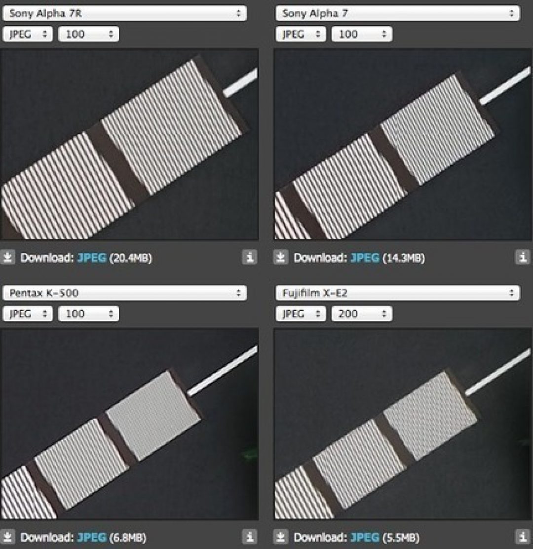
Take a look at this image or click the link below and take a look at the studio comparison tool from dpreview for yourself. Try to ignore DPReview’s tool’s stitching errors, they are not relevant to this comparison.
http://tinyurl.com/falsedetail
Allow me to explain. This is a full resolution comparison of four different cameras shot at base ISO. These are out of camera JPEGs to give the best possible results for the Fuji X-E2. We have the 36mp A7r, 24mp A7, 16mp Pentax K-500 and 16mp Fuji X-E2. The selection of the image shown is a monochromatic resolution demonstration sheet, a part of the varied studio comparison scene from DPReview. What it is isn’t all that important, what matters is that it is A) not colored green and B) depicts fine straight lines set at an angle in the frame. The reason „A“ matters is that finely detailed green materials look terrible on the X-Trans sensor in just about every situation (don’t believe me? Select the green tufts of fake fur on the studio scene and just have look for yourself. Awful.) So here we have the best chance for the X-E2 to show more detail due to eliminating the OLPF (AA filter). The reason „B“ is important is that the nature of digital images makes angled lines hard to draw sharply, you get „steps“ from aliasing. The only way to avoid steps is to blur edges. So what do we see? Well we can see very clear straight lines on the higher resolution, standard bayer array cameras. That’s a big bonus of higher resolution sensors, even with blurred edges in the digital image, there is quite a lot of contrast between the lines. But, even when we look at the 16mp Pentax camera image, you still see rather straight lines though they are all gray-ish (we’re looking at the finest lines here) due to the anti-aliasing effect. So the result here is more of a texture at normal viewing sizes, but, it’s more accurate than the Fuji. Just look at that awful mess. At first, you might think, „Hey, look at that crisp detail on the fuji!“ but, then you realize it hasn’t rendered the actual detail at all. Instead, it’s created an angled checkerboard that, even at smaller viewing sizes, produces an entirely different texture in the image, and of course, at full pixel resolution, is just obviously wrong…….
See on plus.google.com