High-Contrast B&W With Lightroom | Romanas Naryškin
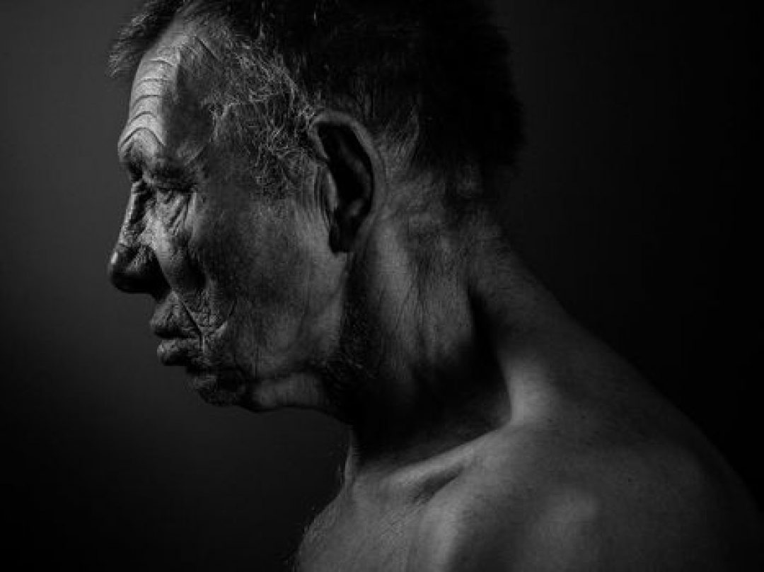
A while ago, I wrote an article on low-contrast B&W conversions with Lightroom. After reading through some of the response the article received I was pleasantly surprised that so many of our readers actually prefer low-contrast look over the ever-popular high-contrast conversions. That is not to say high-contrast B&W photography is in some way inferior, not at all. It is merely the more popular, the more easily accepted sort of look, which is exactly the reason why I saw fit to go against the wave and start with the opposite. Now, ever since I wrote that piece, I’ve received several requests for a similar article on a high-contrast conversion. This topic is particularly tricky for me since I rarely do high-contrast B&W, but the requests did remind me of one occasion where I was deliberately working towards such a result from the very start. And so, as always, we begin with a photograph……..
Source: photographylife.com